Case Study 03
Creating Comfort in Donation: SAFE Alliance
SAFE Alliance runs emergency shelter, counseling and prevention programs across Central Texas. Their donation flow was buried and their merch store had never been designed with intention. I owned the redesign of both, from research through shipped product.
Problem
The why
Government funding was already shrinking, which meant individual donations, the one lever SAFE could pull on its own, had to work harder. But the donation button was easy to miss and didn't feel connected to the mission. That gap between a funding problem and an invisible fix is what made this redesign a priority, not a nice to have.
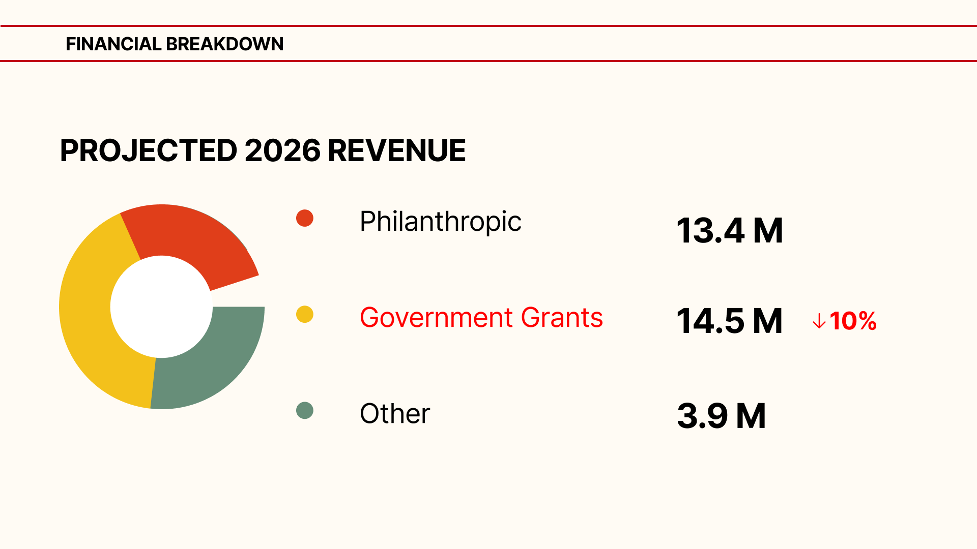
Projected 2026 revenue: government grants down 10%
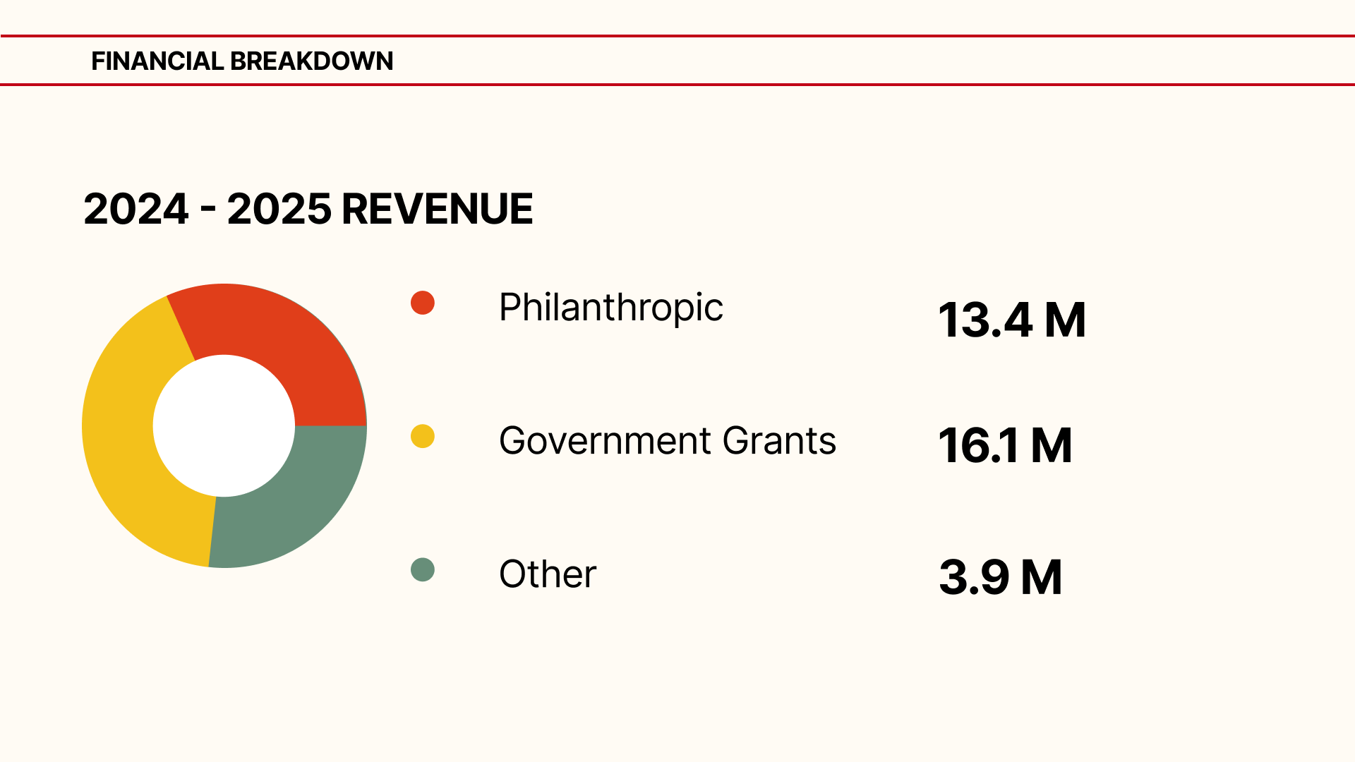
2024 to 2025 revenue by source
What I heard in research
"Donating needs to feel meaningful, not transactional."
Val, Marketing Director"I didn't even notice there was a donation button on the site. It doesn't stand out, and I wish the process felt more meaningful."
Site user"I'd be more likely to donate if I felt connected to the impact. Seeing stories that reflect SAFE's mission would help me understand where the money goes."
Site userHypothesis
If donors could see where their money actually goes and feel connected to SAFE's mission before being asked to give, they would trust the flow enough to complete it.
Auditing the current experience
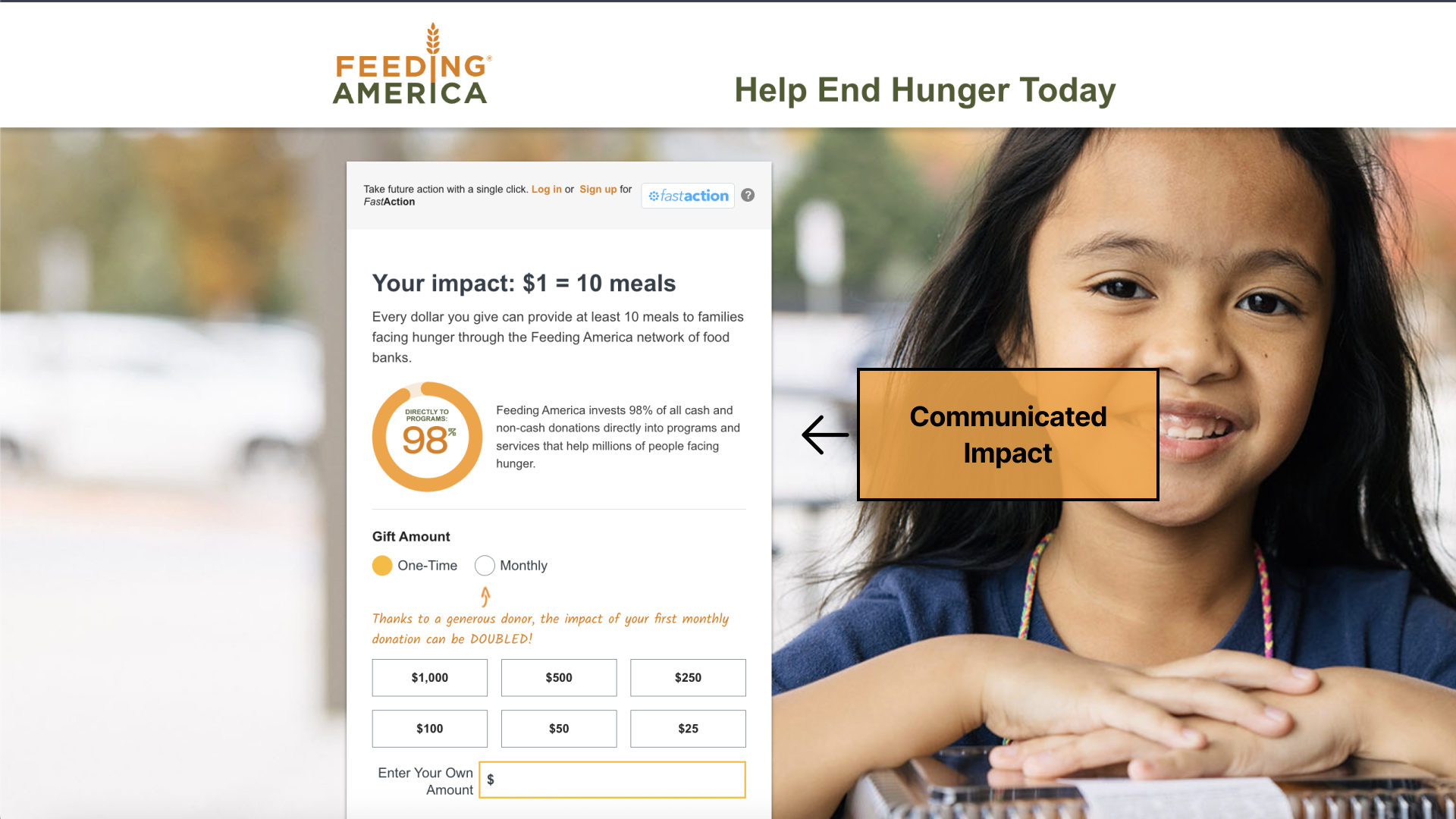
Audited Feeding America's donation page for how a larger nonprofit communicated impact clearly
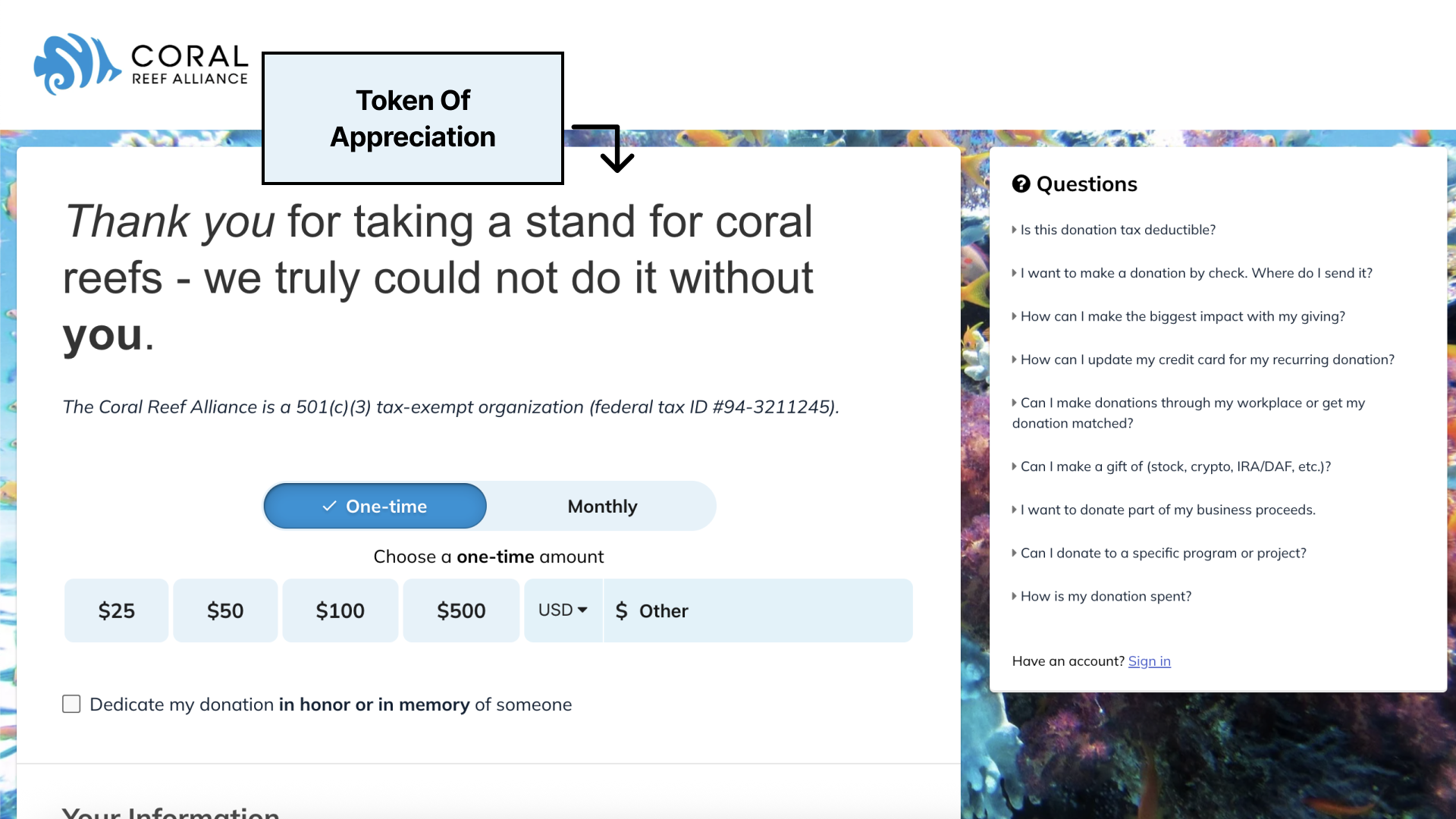
Audited Coral Reef Alliance's flow for how they thanked donors and reinforced trust after giving
Discovery process
User interviews
Competitor analysis
Low fidelity
Ideation
Creation
How AI shaped my process
AI → Ideation → Prototype → User feedback
LLMs helped me turn hand sketches into real UI components, and ideate on color scheme options before I committed to the reduced brand palette.
AI helped me
Expand the solution space and challenge assumptions I might not have questioned on my own, then weigh each idea against user need, business goal, brand, and feasibility.
I decided based on
User feedback, SAFE's mission and goals, and where donors actually lost confidence or dropped off in the journey.
Iterating on the donation flow
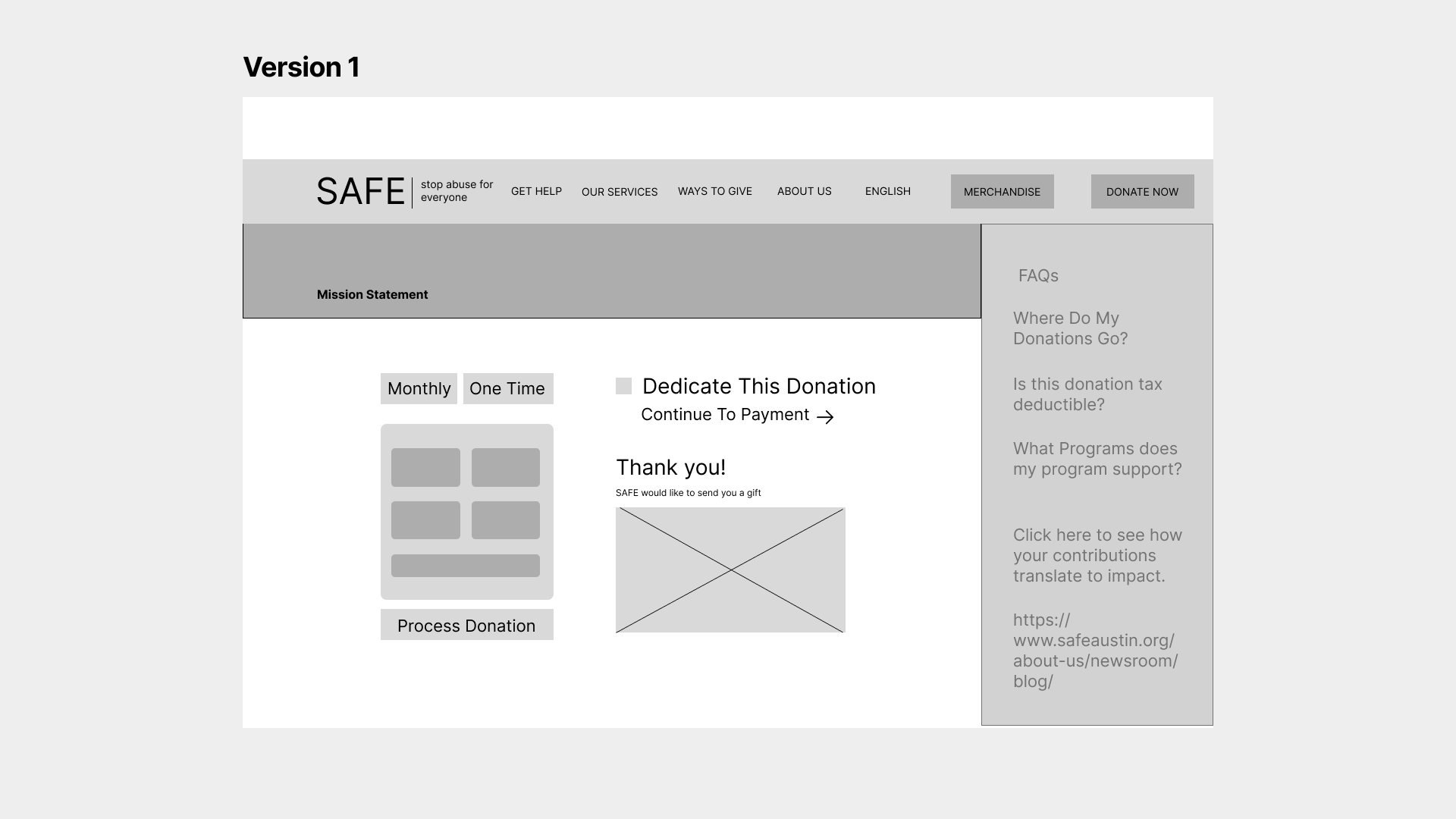
Version 1: mission statement buried below the fold
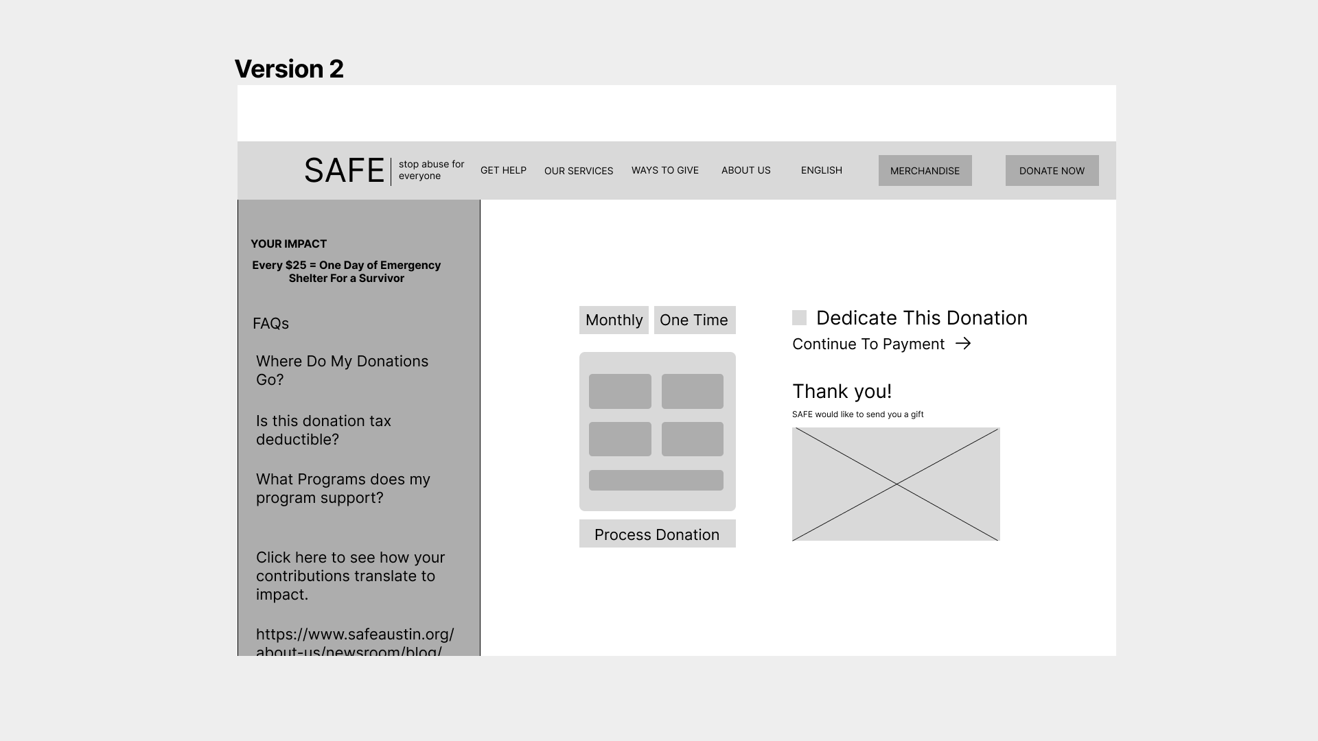
Version 2: surfaced impact stat, still cluttered sidebar
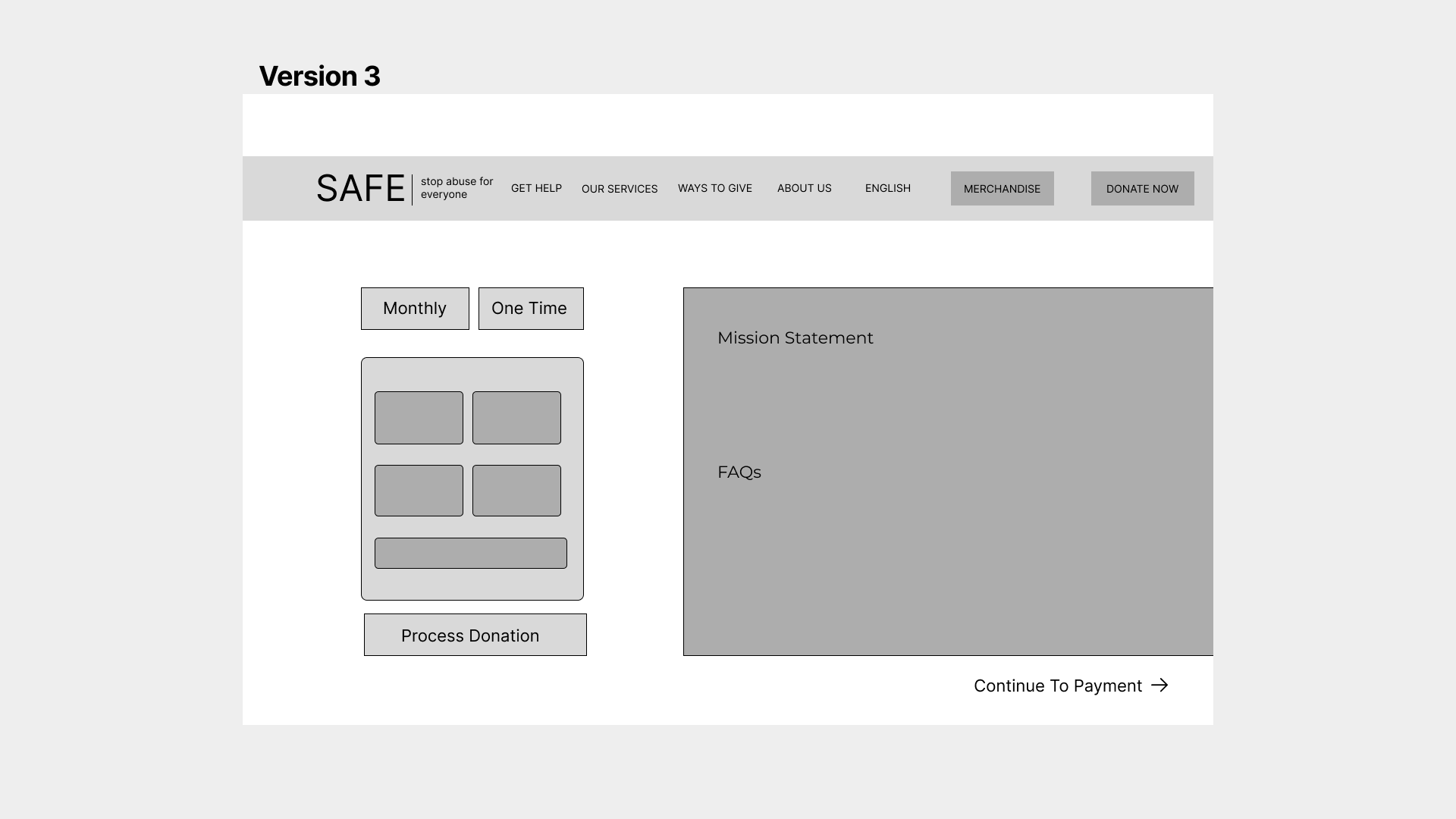
Version 3: single focused path to checkout
Simplifying the brand system
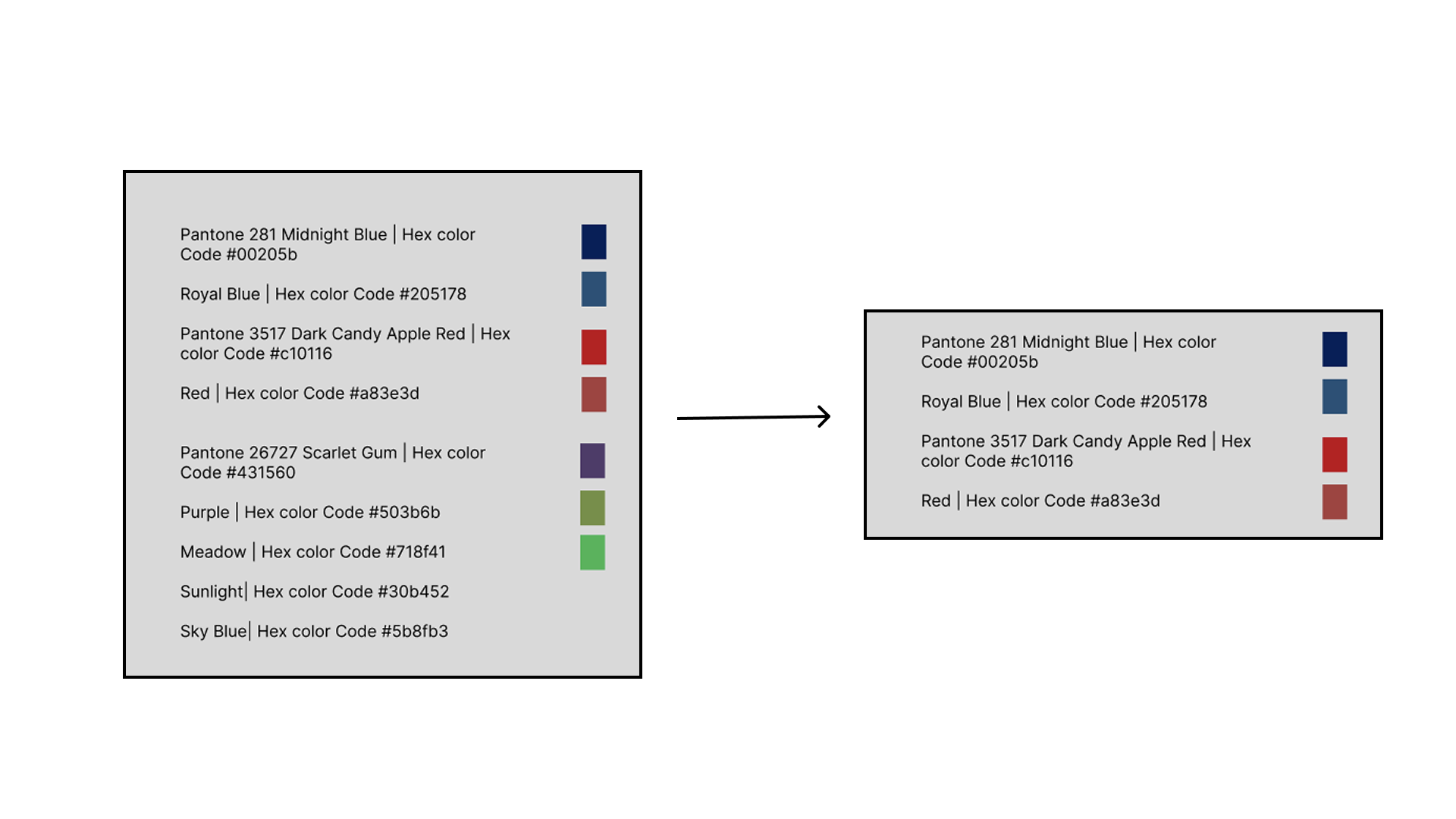
SAFE's palette had grown to nine unlabeled Pantone colors with no clear hierarchy. Red carried special weight in this reduction: for a survivor support nonprofit, red can read as alarming or triggering, so it was minimized rather than used as an accent. The reduced system also fed directly into the merch designs below, which needed to feel nurturing and inviting rather than clinical.
Final design
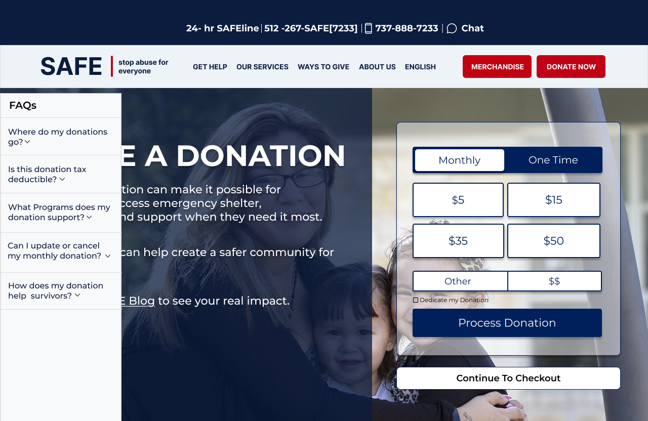
Donation page, redesigned
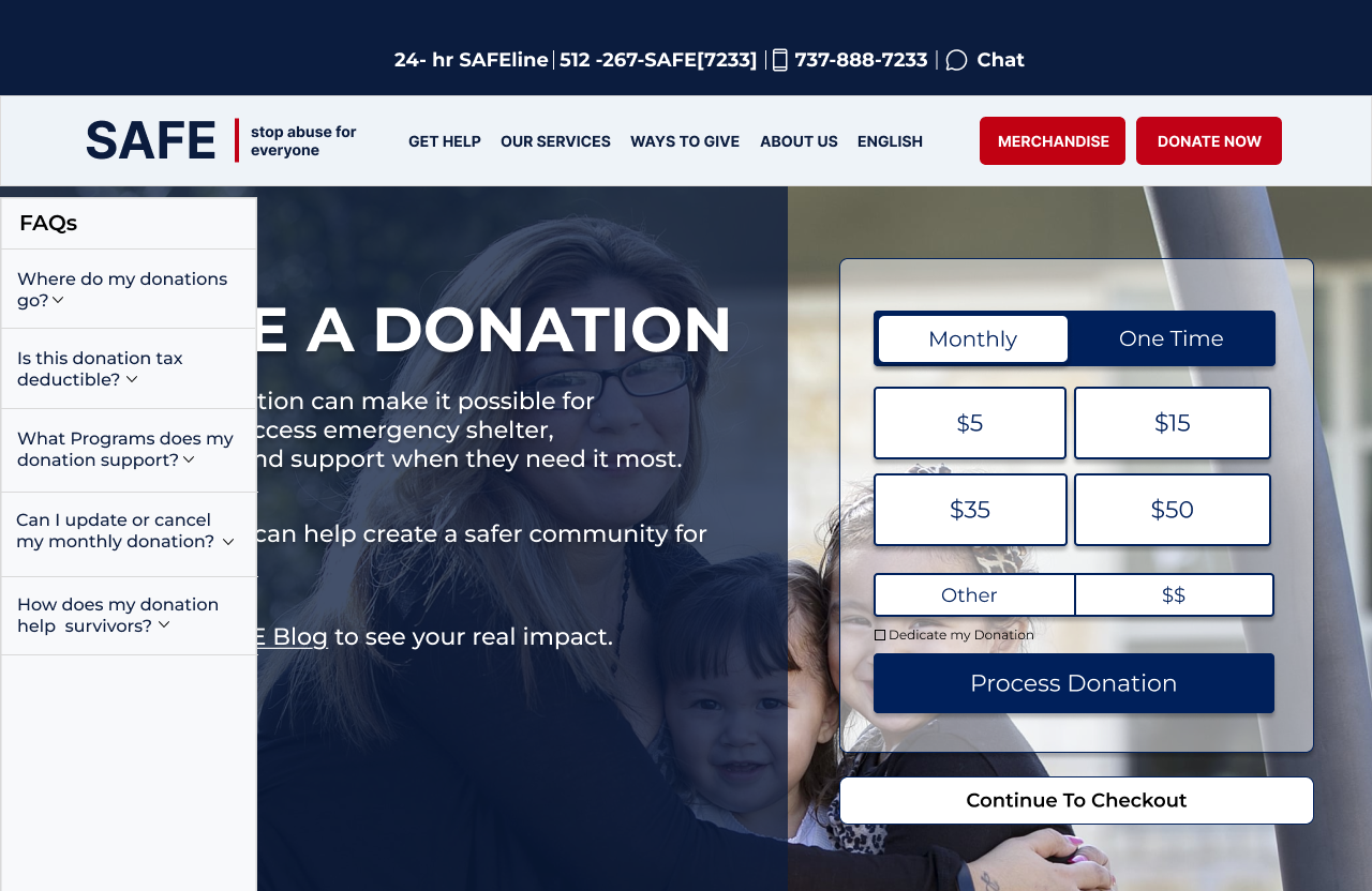
Expandable FAQs answer donor questions inline
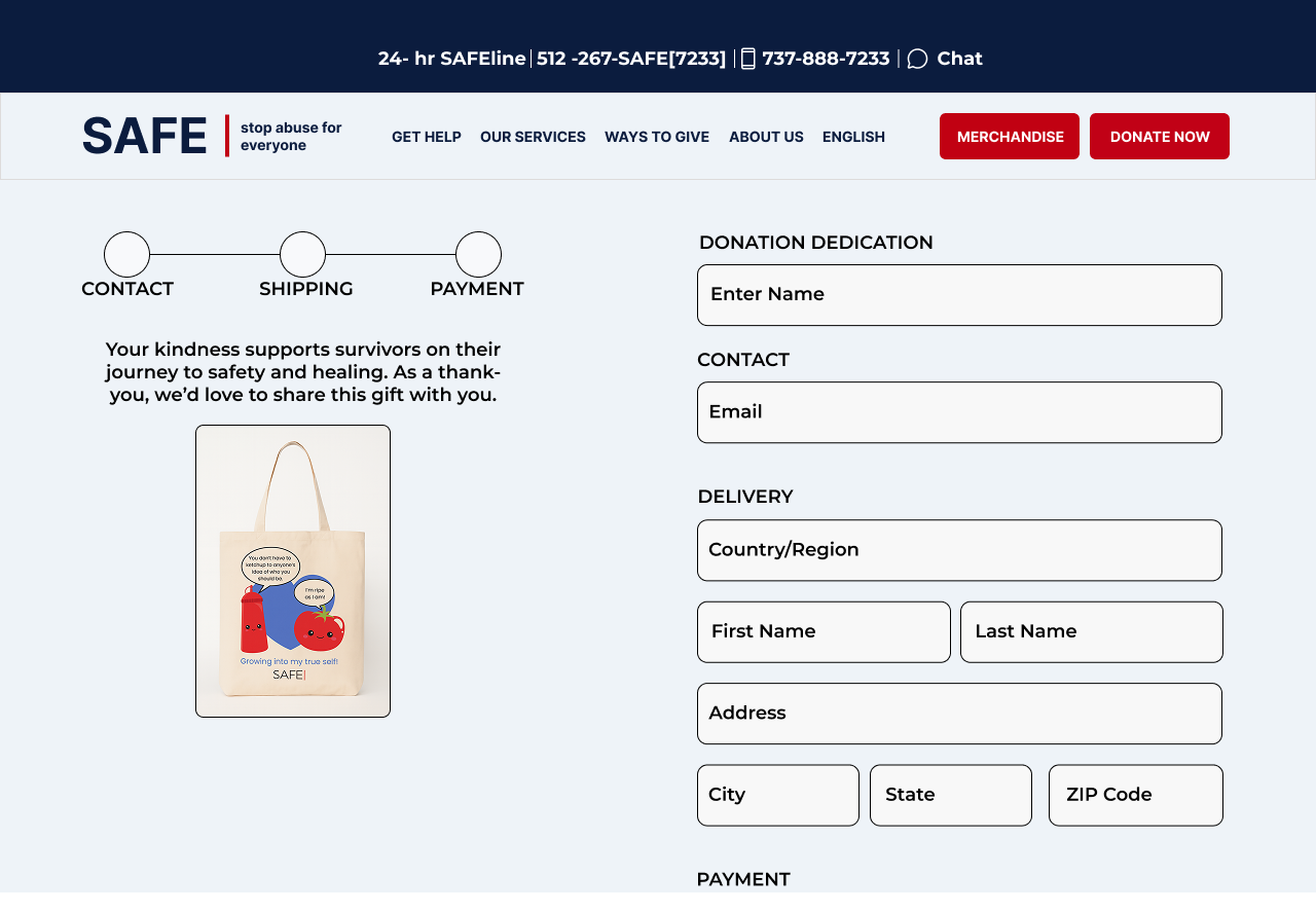
Streamlined checkout for merch orders
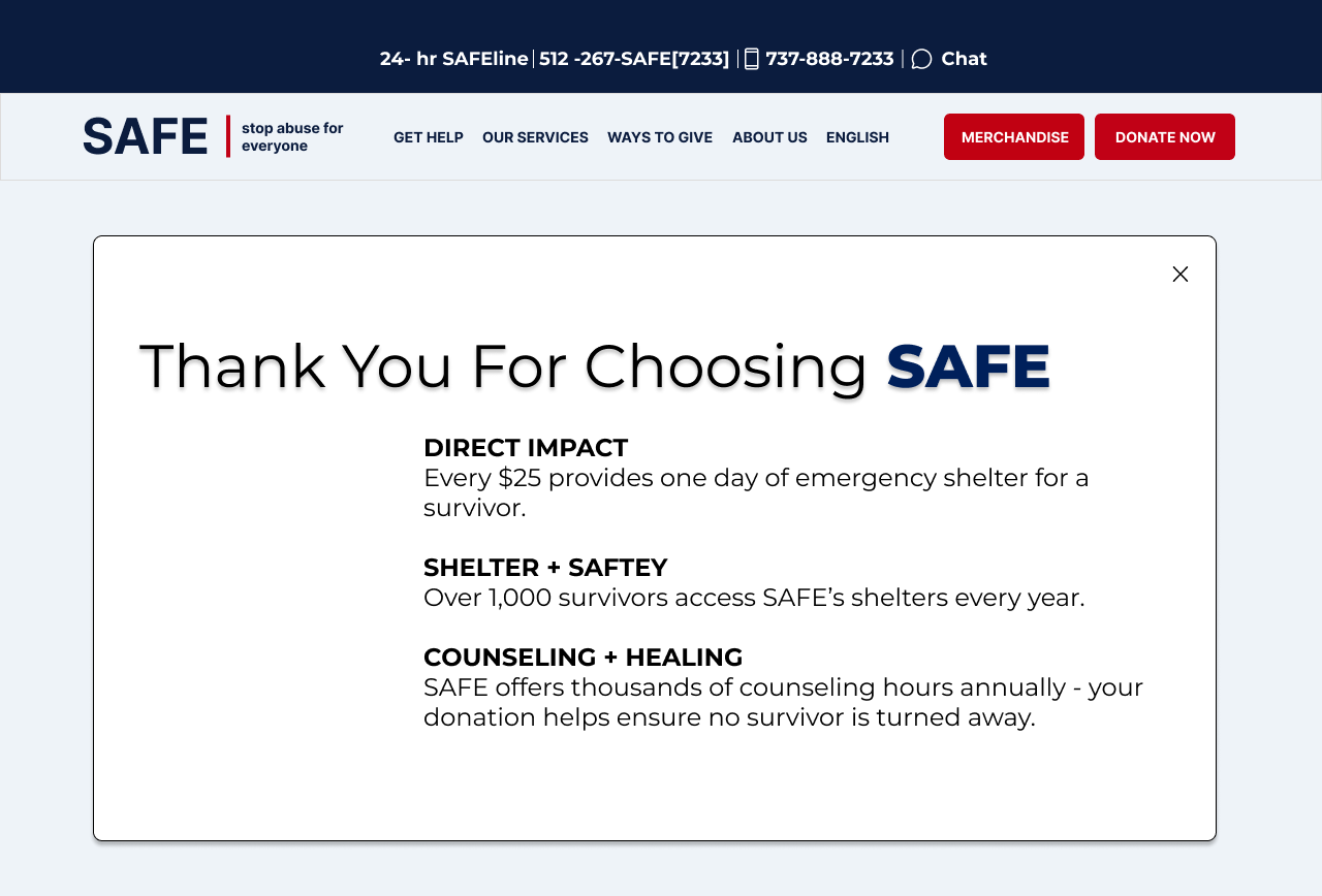
Thank you modal reinforces impact after checkout
Prototype
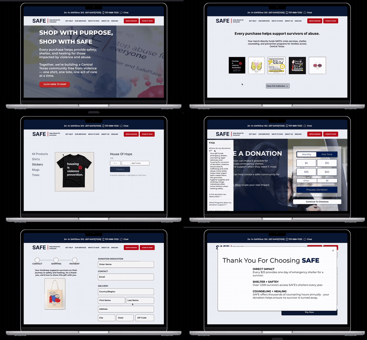
Watch the live donation and merch flow play out!
Results
What I learned
Key learnings
- Emotional framing decides completion. Not just flow length, whether someone felt connected to the mission mattered more than how many steps were left.
- Small details compound in testing. Color contrast and consistent text sizing made a disproportionate difference in usability results.
What I would do differently
- More mid-fidelity, earlier. I'd build out more mid fidelity frames before jumping straight to high fidelity.
- Donor mindset first. I'd spend more time understanding how donors think before testing, not just after.