Case Study 01
Clearly
Clearly is an accessible AI answer experience, designed for people who listen to AI chat products with a screen reader instead of reading them. Most AI products read an answer one way: start to finish, all at once. Clearly gives that control back, with three listening modes, shortcuts that hold still, and a VoiceOver script I wrote line by line, not left to whatever the screen reader happened to pick up.
Problem
The why
The idea came out of noticing how much AI chat products assume about the person listening. An answer either reads start to finish or not at all. There's no way to hear the shape of it first, skip to what matters, or pause mid-answer without losing your place, exactly the kind of invisible barrier that came up again and again through my time with Best Buddies, where technology was consistently what got in people's way more than attitudes or access ever were. Before settling on this, I considered a group decision helper and a command palette concept. This direction won out because the gap felt the most overlooked, and the closest to design work I actually want to keep doing.
What I tested first
Before sketching anything, I turned on VoiceOver and asked a regular AI chat product the same question Clearly's own script later answers: how to plan a group trip in five steps. No structure, no way to skip ahead, and long stretches spent reading sidebar labels and buttons before it ever reached the actual answer. That recording is what made the hypothesis below concrete instead of theoretical.
VoiceOver reading a standard AI answer, unscripted and unstructured, the exact experience Clearly was built to fix
Who I designed for
The first answer
Needs orientation, not a manual
Hasn't picked a listening mode yet. A three-step setup sets a default in under a minute, or can be skipped entirely in favor of Skim.
Every answer after
Wants control mid-stream
Knows the shortcuts. Needs to pause, skip ahead, or jump to a summary without the interface getting in the way or shortcuts moving around.
Hypothesis
If an AI answer is read in structured, controllable chunks instead of start to finish, a screen reader user can get to what they need faster and with less effort than listening to the whole thing.
Designing three ways to listen
Onboarding sets a default mode in three short steps, pre-filled from the first choice, so a user can press Enter twice and be done: Skim gives a short summary and the main headings, Study reads the full answer one section at a time with a pause after each, and Quiet only announces when an answer starts and finishes, leaving the pace entirely to the user.
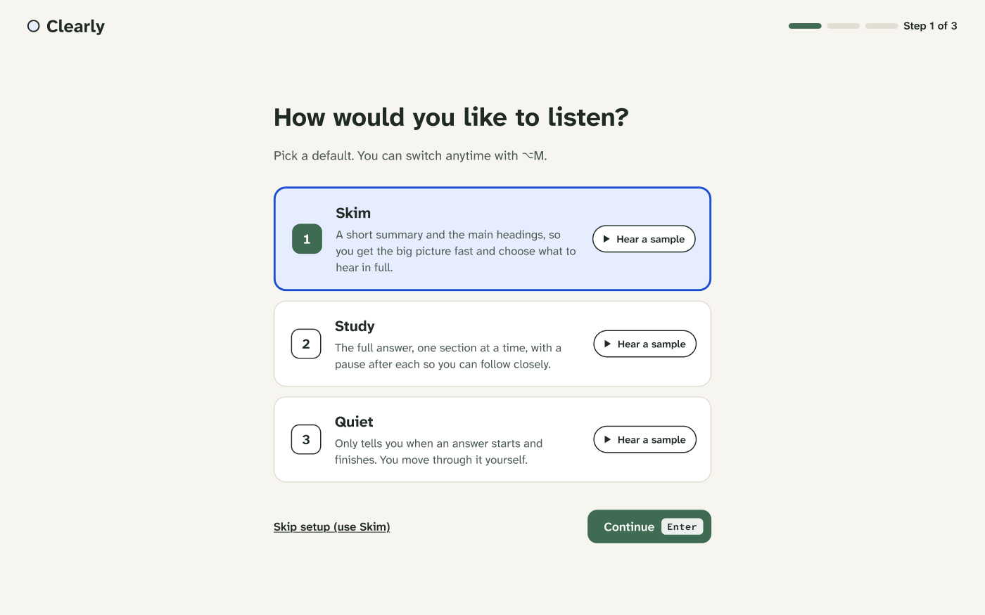
Step 1 of 3: pick a default, with a sample for each
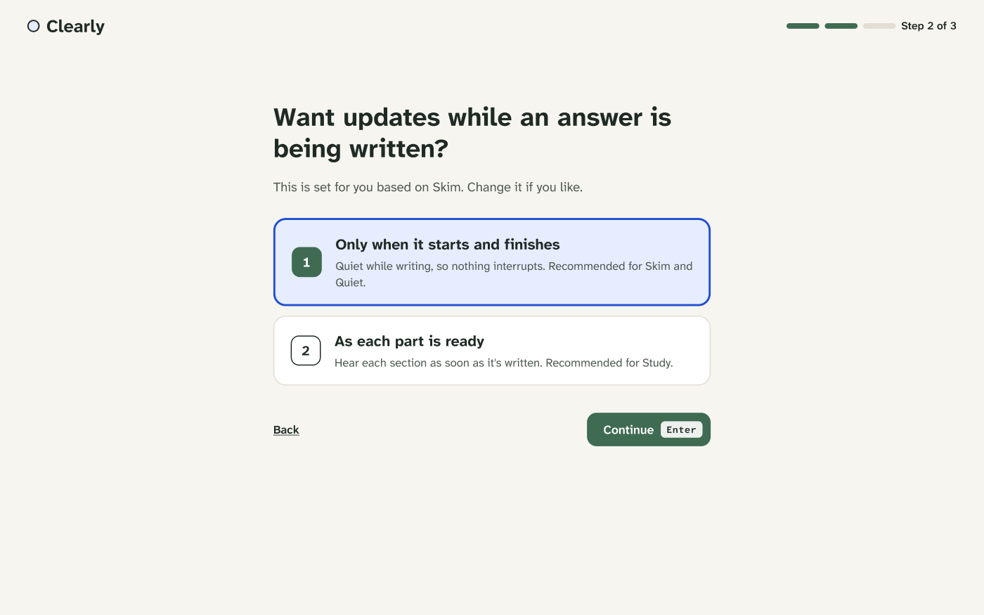
Step 2: pre-filled from step 1, change it if it doesn't fit
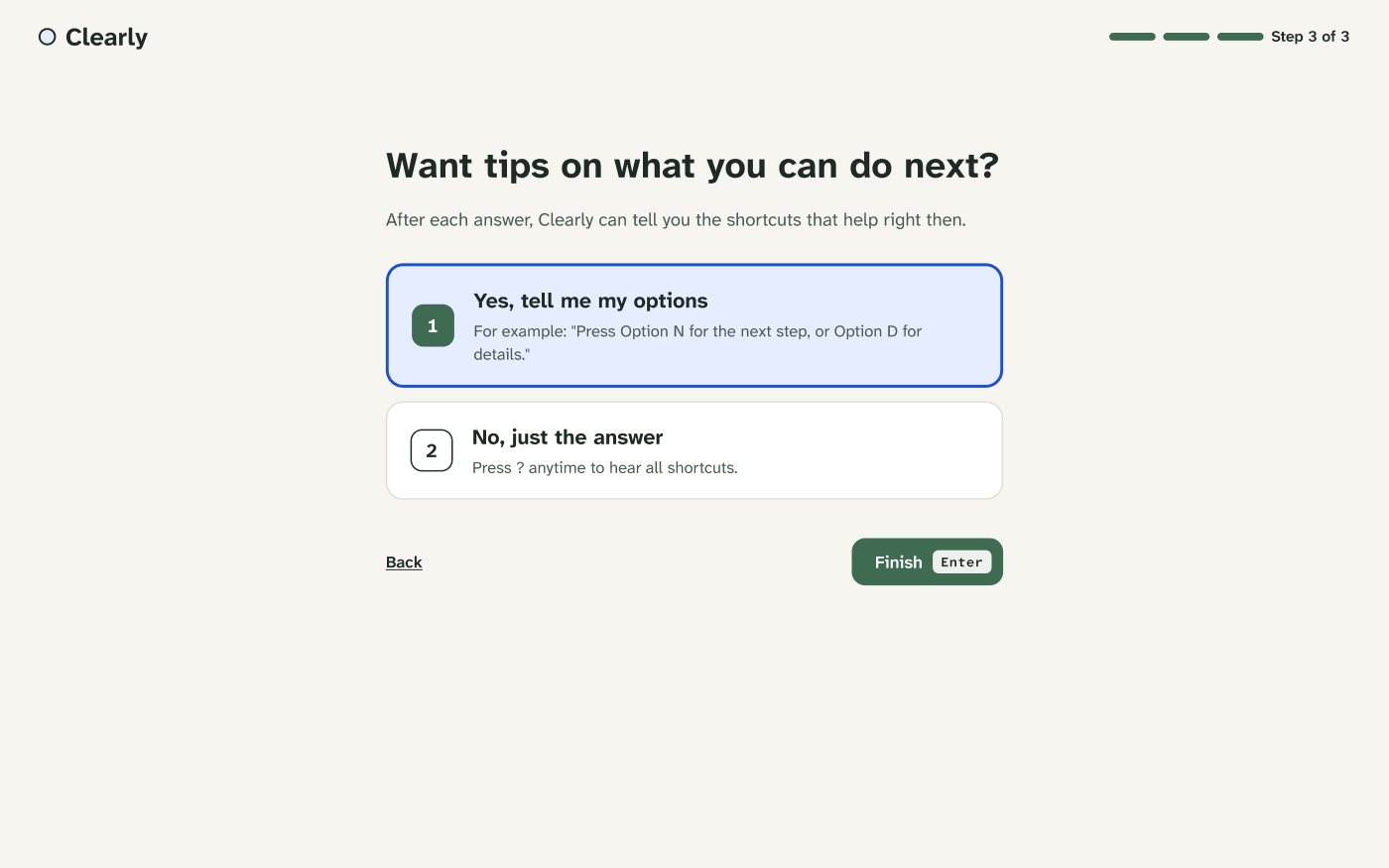
Step 3: tips on, tips off, both are one tap away from reversing
What VoiceOver actually says
Visual design was the easy half of this project. The harder, more unfamiliar half was writing exactly what a screen reader says at every state, finish, pause, stop, mode switch, so nothing is left to whatever VoiceOver happens to pick up off the page.
"Answer ready. 5 steps for planning a group trip. Step 1: Agree on the basics together. Press Option D for details, or Option N for the next step."
When the answer finishes"Paused. 2 of 5 steps written." Press again: "Resumed."
Option P, while writing"Stopped. 2 of 5 steps were written. Press Option R to hear them."
Escape, while writingThe answer, built to be heard
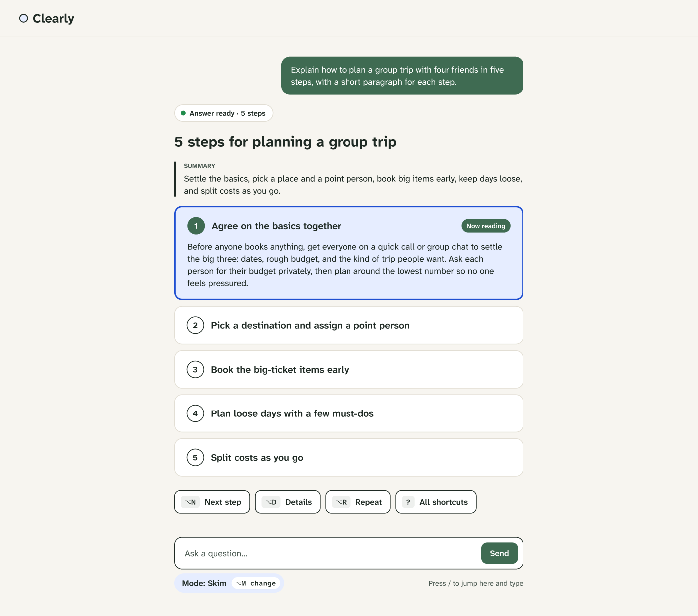
Skim mode: a summary first, then steps that work as both visual anchors and VoiceOver focus targets
Writing without interrupting
While an answer streams in, the shortcut bar swaps Next, Details and Repeat for Pause and Stop in the exact same position, so a screen reader user's muscle memory holds even mid-stream, and VoiceOver stays silent by default so nothing talks over the writing.
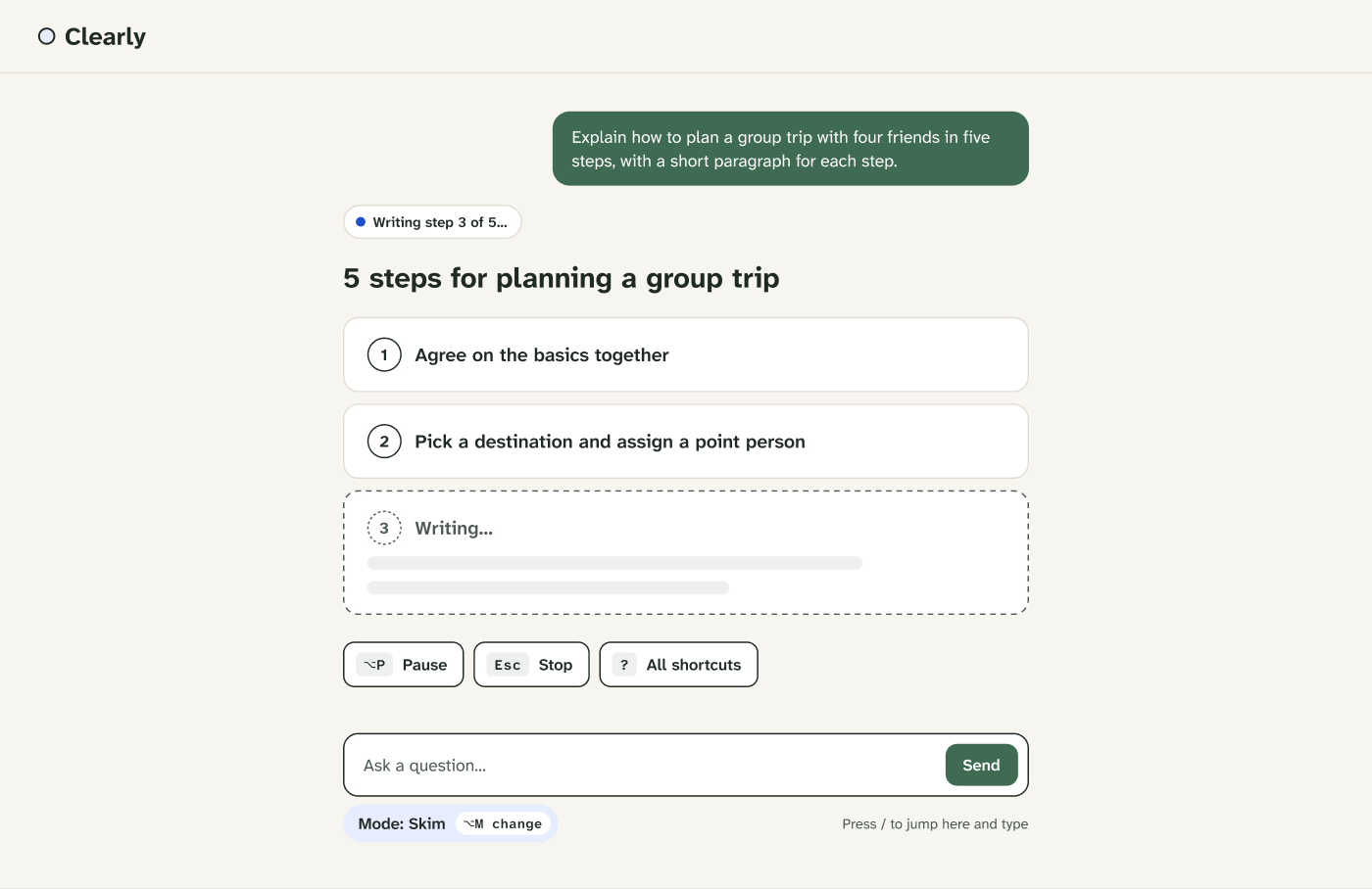
Generating: controls occupy the same spot they'll return to once the answer is ready
Keeping shortcuts and history close
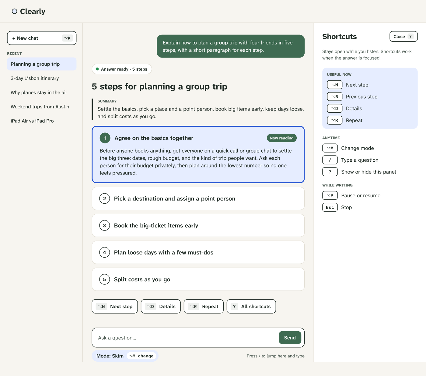
The full interface: chat history on the left, shortcuts panel on the right, both reachable without losing the answer
Starting fresh, confirming a switch
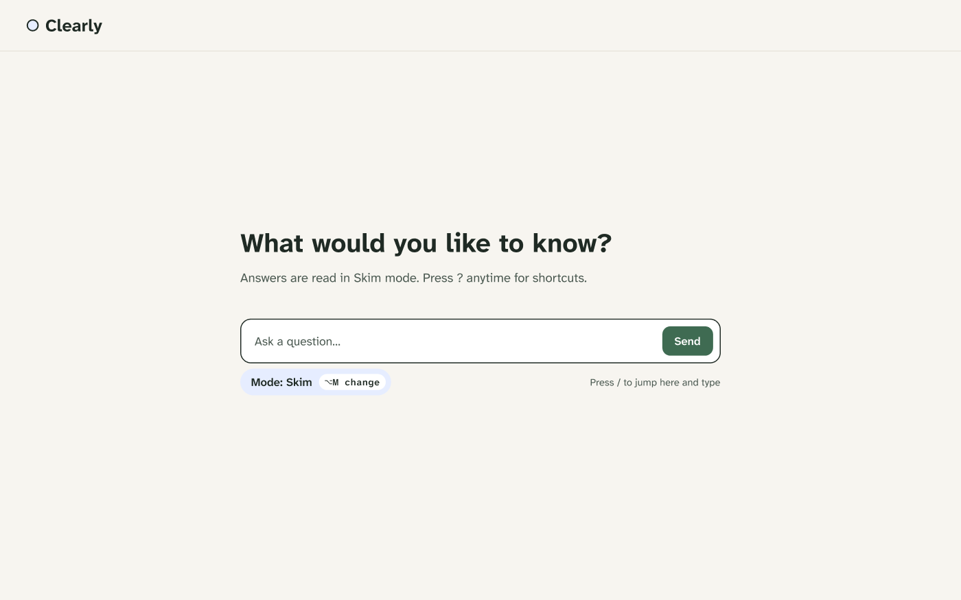
Empty state: mode is visible before the first question is even asked
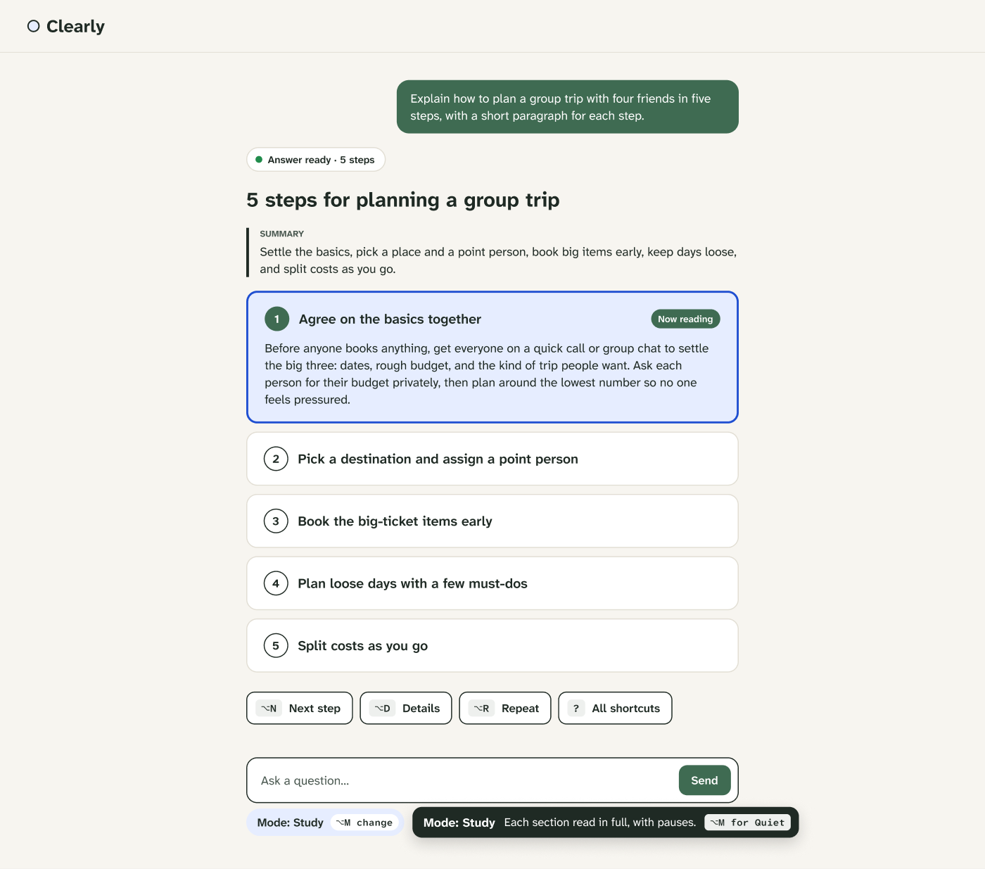
Mode switch: the toast text is exactly what VoiceOver announces, so sighted and non-visual feedback always match
Prototype walkthrough
Walking through Clearly's listening modes, shortcuts and VoiceOver script in motion
Results
What's next
What I learned
Key learnings
- Writing the screen reader script surfaces decisions visual design hides. Every pause, every announcement, every bit of silence had to be an explicit choice, not an accident of markup.
- Streaming interfaces need more states, not just a start and an end. Generating, paused, and stopped each needed their own shortcut bar and their own script.
What I would do differently
- Design for the extension constraint from day one. The nav, chat history, and top bar here assume Clearly owns the whole window. An overlay that layers onto someone else's chat product needs a much lighter footprint.
- Keep the script separate from the screens. I wrote the VoiceOver copy as Figma text layers alongside each state. Drafting it as its own document from the start would make it far easier to carry straight into a build.