Case Study 04
Locus
Study smarter, together. Locus helps UT students find and rate study spots that actually fit their needs, from noise level to outlet availability, instead of guessing and showing up disappointed.
Problem
The why
Before a single screen was designed, student interviews surfaced the same frustration: no way to know whether a study spot would actually work, noise, seating, outlets, before showing up. That gap between walking somewhere and knowing it would work is what Locus set out to close.
Who I designed for
Megan, 28
The overwhelmed night owl
Studies late, needs to know what is open and what the vibe will be before she leaves her apartment.
Adam, 19
Group coordination chaos
Constantly texting friends back and forth to find a shared study spot that works for everyone.
Mapping the journey
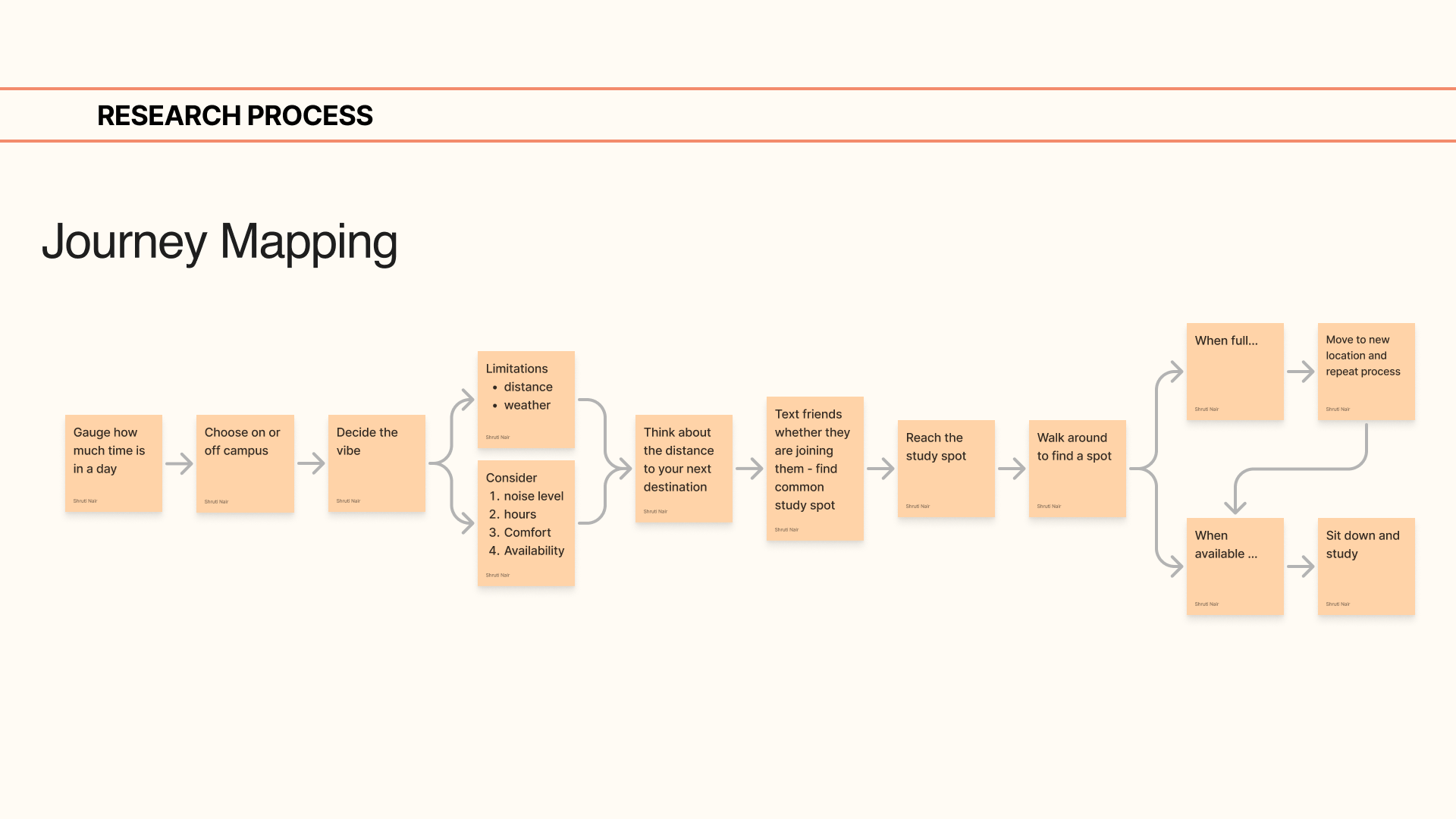
Hypothesis
If students could see noise, lighting, seating and outlet availability before they left for a study spot, they'd stop wasting trips on ones that don't actually fit.
How AI shaped my process
AI → Problem exploration → Feature ideation → Prototype
With six sprint cycles and a hard beta deadline, AI helped me move faster through the exploration phase so more time could go toward testing with real students.
AI helped me
Explore a wider range of possibilities and pressure test concepts before deciding what was actually worth building.
I decided based on
20 user interviews, what students told us they needed, and what the team prioritized as most feasible to ship.
Features from findings
Discovering spaces from preferences
Filter by noise, lighting, seating and outletsStudy circle tracking
See where friends are studying in real timeRating spaces for the community
Crowdsourced reviews keep listings honestFinal screens
Scroll to see all seven →
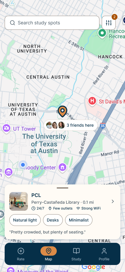
Map view: a selected spot's card, with friends studying nearby surfaced right on the pin
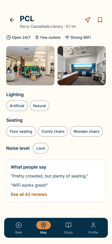
Spot detail: photos, amenity tags and real reviews, all in one scroll
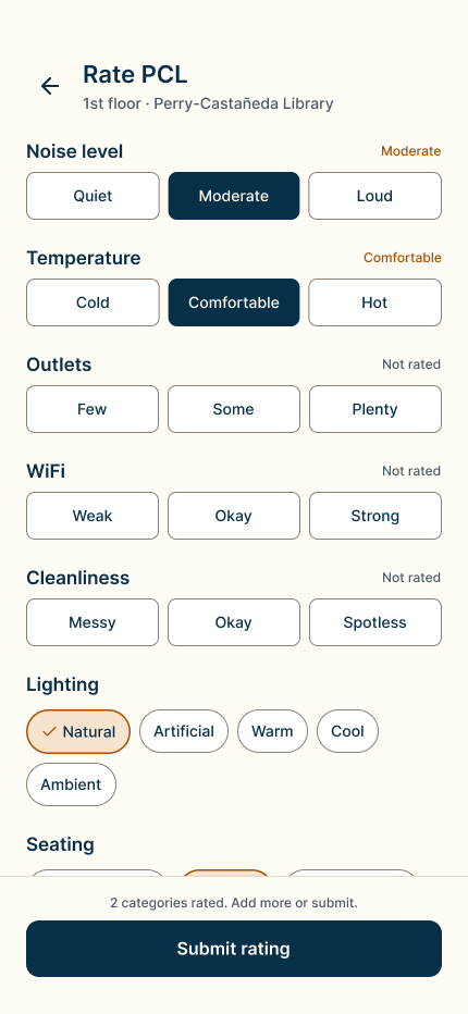
Rating a spot across six categories, each optional so partial ratings still count
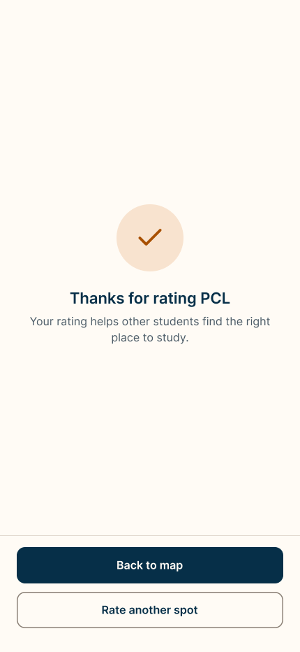
Confirmation after submitting: a clear thank-you, with an easy path to rate another spot
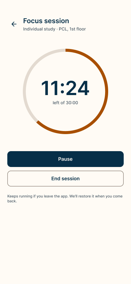
A running focus session, with the timer surviving if you leave the app
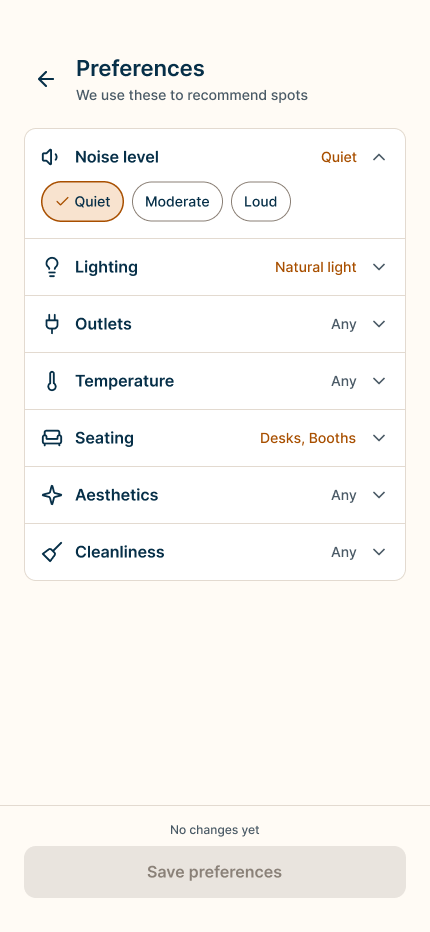
Preferences: every factor Locus uses to rank spots, in one place
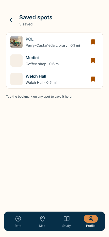
Saved spots, bookmarked in one tap from anywhere in the app
Prototype walkthrough
Discovering, filtering and saving a study spot in the live prototype
Results
What I learned
Key learnings
- Fewer taps beat cleaner structure. The accordion-style preferences screen looked tidy, but switching to a flat checklist in later iterations cut friction without losing clarity.
- Interview findings outperformed assumptions. Features built directly from the 20 interviews, like study circles, tested better than ideas the team carried in from day one.
What I would do differently
- Test earlier, not just at the end. With six sprint cycles and a hard beta deadline, usability testing landed late; I'd pull it earlier next time.
- Protect testing time when scope grows. Adding study circle tracking mid-build was the right call based on interview feedback, but I'd protect testing time for it better next round.